Data Visualization Guide
Which chart is right for my data?
by Michael Benison
City governments collect a significant amount of data that
is valuable to a vast cross-section of the public. Cities sift
through a lot of data from departments including public safety,
environment, education, housing, health, business, transportation,
social services, etc. Managing all this data in the various
departments to achieve results can often be overwhelming.
With visualizations, cities can extract actionable information and
insights, analyze data, track performance, look at trends, answer
questions of interest, and improve service delivery. In most cases
cities value the importance of using charts and graphs to understand
data but often confront the challenge of choosing the right type of
visualization for the right kind of question.
Understanding the reason
why you might need a visualization for a particular report or analysis
is the first and critical step to choosing a chart. Your choice of
chart/graph would depend on the type of question you want to answer.
There is an inexhaustible number of chart types but the following are
common and can be used to meet your data visualization needs.
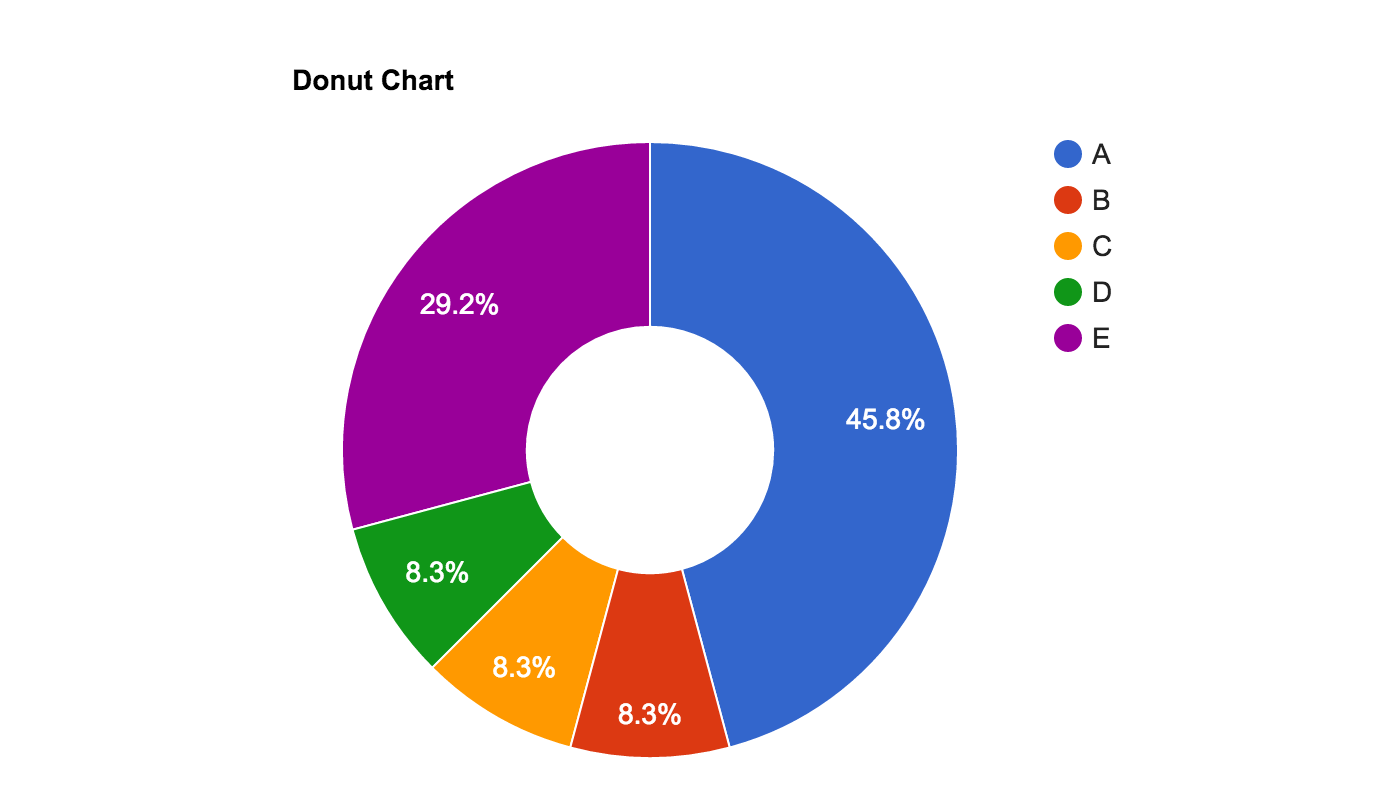
Donut Chart
Circle chart divided into slices to illustrate numerical proportions or percentages. Size of each slice is proportional to the quantity it represents.


Histogram
Displays information using rectangles of equal width to show the frequency of data in consecutive numerical intervals of equal class size.

Scatter Plot
A set of individual dots displayed in a Cartesian plane where each dot denotes an observation for a set of data.


Gantt Chart
Made up of a series of horizontal lines displaying the amount of work or production completed and uncompleted at different time periods.


Stacked Bar Chart
A column chart stacked in groups to show the value of the data category it represents.

Tree Map
Rectangular chart split up into subrectangles that are sized and ordered in quantitative magnitude.

